
It is surprisingly difficult to find a definition of what makes a great website. Too often it’s said that developing a great website, ‘is more art than science’ that great websites, ‘just feel right’ and that, ‘like a sprinkling of fairy dust, the effect is important but indescribable’.
There are however 5 key characteristics that a website must have in order to deliver a great experience for its users – which after all is what makes a website great.
5 Website Must Haves
In order to deliver a great experience for its users a website must be:
- Useful
- Intuitive
- Consistent
- Accessible
- Appealing

I have not plucked these 5 characteristics from thin air, there are in fact International Usability Standards for the human-centred design of interactive systems, but while it is refreshing to see such a straightforward list, I appreciate that it can also seem slightly disappointing in the first instance. It can feel no more helpful to be told your website must be useful, than it is to be told to sprinkle some fairy dust on it!

However, let's explore each of these must have characteristics in detail and how they can be achieved.
A Website Must be Useful
When people visit a website, they might be looking for an answer to a question, hoping to find a definition, or seeking to take an action. By presenting content that’s relevant to the visitor — that is, content that’s aligned with an individual’s stage in the buyer’s journey — a website will be useful.
So, what is the buyer journey?
The buyer’s journey is the research process that an individual takes leading up to a purchase. A website’s content should answer its visitors’ questions at each stage of their research, and help them progress towards making a buying decision and becoming a customer.

The buyer’s journey consists of three stages:
- Awareness stage
- Consideration stage
- Decision stage.
In the awareness stage the individual recognises an issue that needs to be resolved. They begin researching the issue to better understand and frame their problem.
In the consideration stage the individual has a clearly defined idea of the problem and are researching all the potential solutions for their issue.
By the decision stage they have evaluated all the different solutions and must now choose a vendor to help them solve their problem.
For a website to be useful it must offer content that is relevant to visitors at each stage of the buyer's journey. But that’s not all - it must also be useful to your customers, providing content that is relevant to them. This is likely to be different to the information that is useful for your prospects.
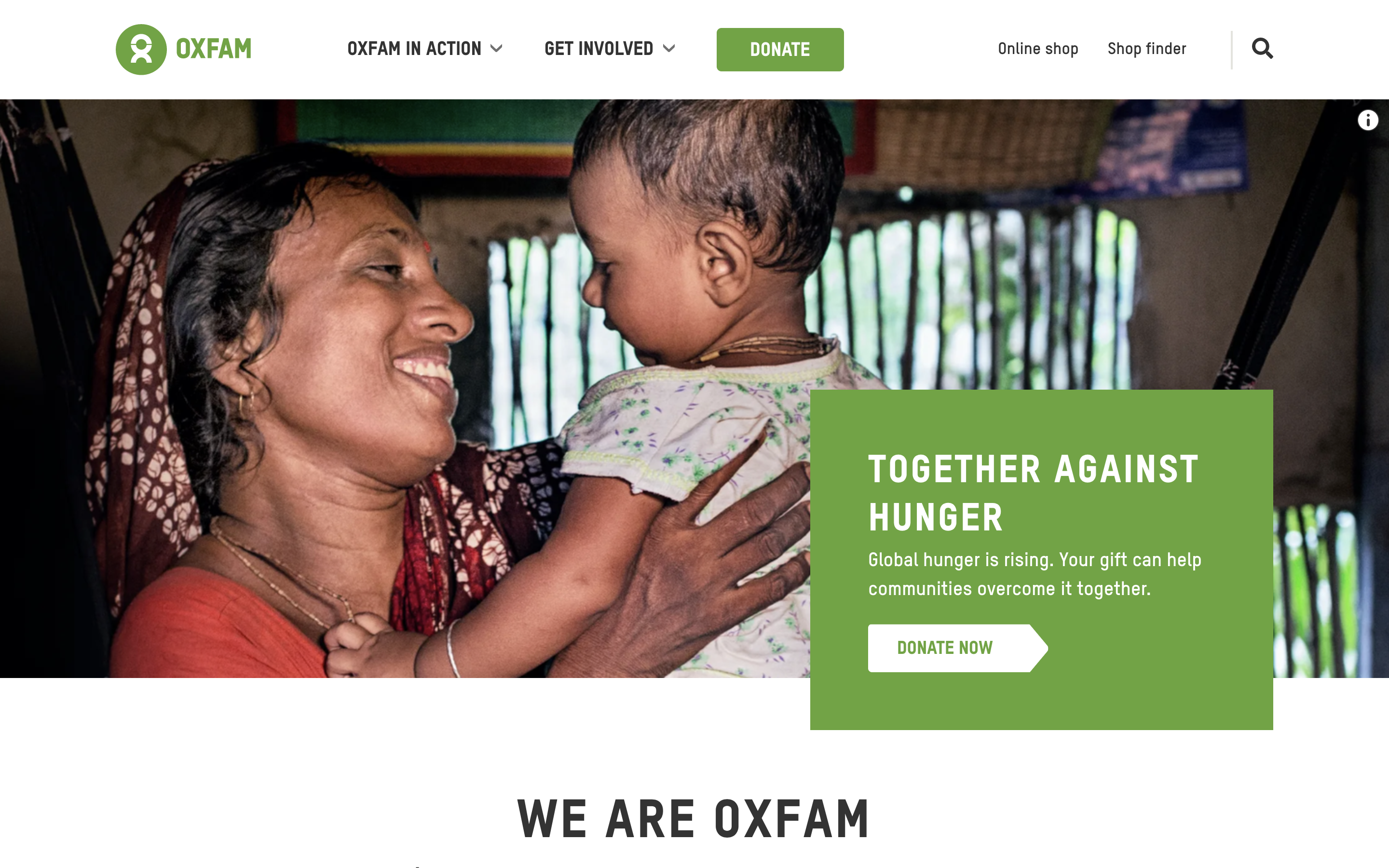
Thinking in this way will always be helpful in creating a useful website, even if it’s not for a company with what we what we generally think of as customers and prospects. For example, Charities don’t immediately seem to fit this mould, but they are generally looking for donations and should create content relevant for website visitors at every stage of their journey to making their decision to donate – and also for donors.
A Website Must be Intuitive
If a visitor to a website doesn’t know where to look or what’s relevant to them, it can be both confusing and frustrating. We have all been there - not being able to quickly see where to find the information we want from a website and so clicking off it.
However, building an intuitive website is not easy. It becomes simpler however, if you know the three main elements of an intuitive website.
3 main elements of an intuitive website
1. Each page answers one question at a time
When you try to provide multiple answers and solutions on a single page, it can quickly become cluttered and confusing for the visitor. And that’s the opposite of a good user experience.
On each page, consider what top questions a visitor might have and provide content that addresses those questions, one at a time.
For example, most visitors to your homepage will be at an earlier stage of the buyer’s journey. They may even be first-time visitors. They will have different questions – and require different content - to the visitors on your Products or Services pages who are probably a bit further into the buyer’s journey.
No matter which page you’re creating on your website, ensure that the page is for one visitor problem at a time. When people can understand a page’s purpose and content at a quick glance, it creates a positive user experience.
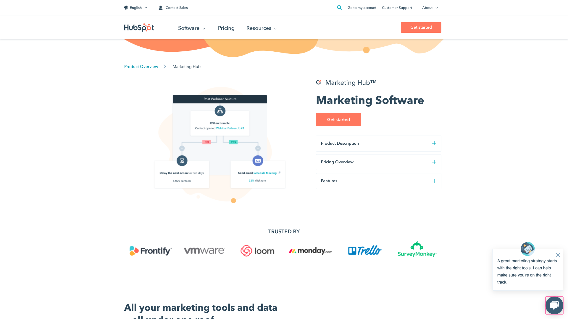
HubSpot sells several different software solutions but it makes a clear distinction between them by having a product overview page for each one.
2. Each page asks a visitor to take one action at a time
This action should be relevant to the content you are providing on that page. So, if for example a visitor is on your About Us page, suggest they read a testimonial. If they’re on a Products or Services page, offer a case study.
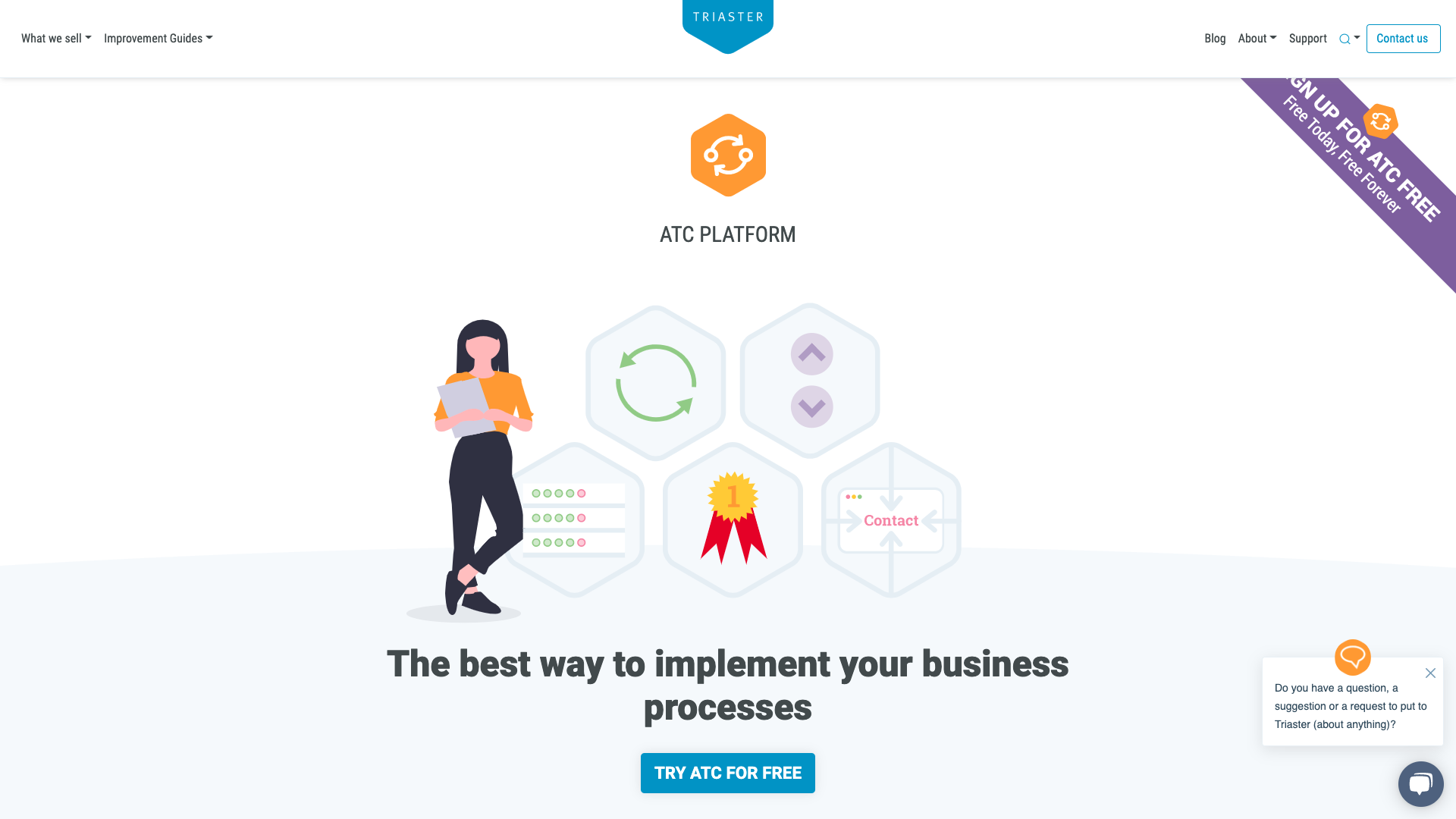
This page on Triaster's website is focussed on getting users to sign up for a free version of ATC Platform and doesn't ask the users to take any other actions.
3. The content guides the visitor to their individual next stage of the buyer’s journey
Don’t try to lead people to a pricing guide on their first website visit. Meet your visitors where they are on their buyer journey, not where you want them to be.
A Website Must be Consistent
Humans inherently like familiarity. This phenomenon is called the mere-exposure effect. The more familiar we are with something, the more we like it.

A great website takes advantage of the mere-exposure effect by creating consistency across the whole site. This means consistency of:
- Design
- Layouts
- Colours and fonts
- Content .l;ł
Having consistent content means website visitors don’t need to figure out if your “free trial,” “10-day trial” and “trial offer” are the same thing.
A Website Must be Accessible
An accessible website must comply with web accessibility standards for things such as readability for screen readers, colour contrast and font size, and also make it easy for visitors to find content.
Help your visitors to easily find the information they need by creating good navigation menus. If a visitor is looking for your pricing page, help them get to it quickly by creating a navigation that’s logical and consistent with what they need.
Include a navigation menu in your header and footer. This will simplify navigation and keep visitors engaged once they’ve finished reading a page.
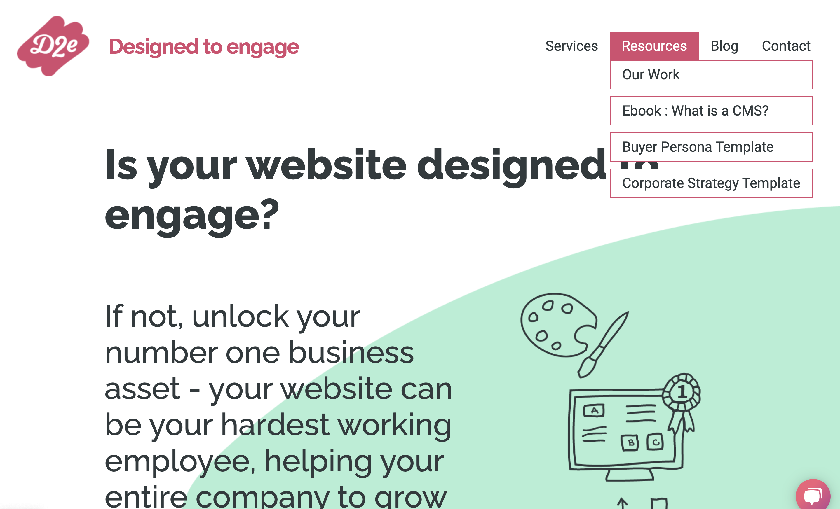
Choose a navigation style: flat or deep. Flat navigation has one level, so all the menu choices are in one row. With deep navigation, the first level of navigation has fewer items, but each menu item contains a sub-navigation menu. D2e's website uses deep navigation.
The key thing is to keep it simple.
To keep navigation simple for your users, aim to have no more than seven menu items in your main navigation, and in most cases, have no more than three levels of sub-navigation. Don’t give your users too many choices.
If visitors can’t figure out a website’s content or navigation, they’ll leave quite quickly.
A Website Must be Appealing
This means appealing to its intended users. Think about the style that would best appeal to them. Are they for example predominately engineers? In which case they will find something practical and simple appealing. If they are marketers however, they are likely to find something a bit flashier appealing. The key thing here is what is appealing to your website visitors, not to you.
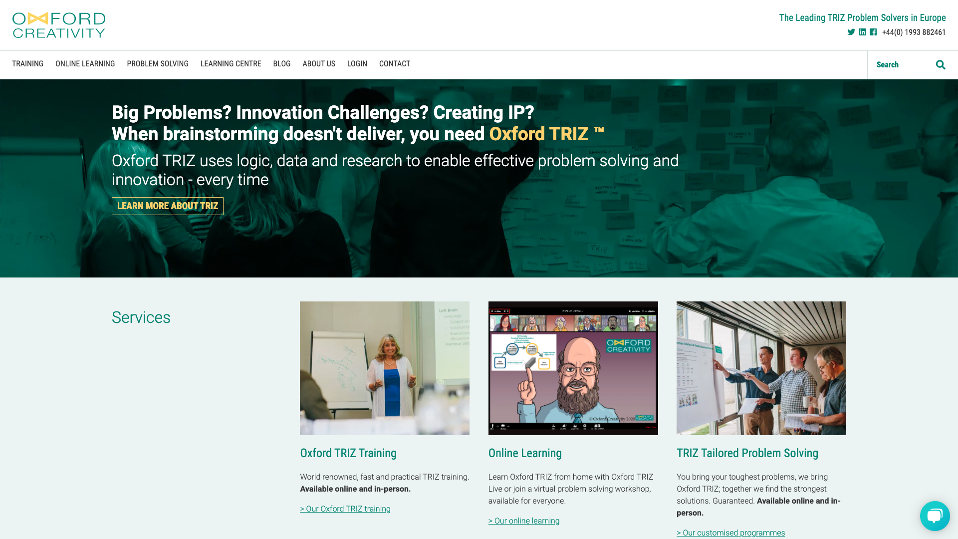
Oxford Creativity's target audience are mostly scientific so they kept their design simple to appeal to them.
When thinking about the appeal of your website, do also keep the intuitive principle in mind as well. You’re solving one goal per page, so choose your layout and the elements on the page wisely.
So, that’s what a great website looks like:
- Useful
- Intuitive
- Consistent
- Accessible
- Appealing
Research shows that 40% of people don’t return to a website when their first visit is a negative experience, so it’s definitely worth striving to ensure that your website looks great.
D2e use the Growth Driven Design approach to designing and delivering websites that always have the five key characteristics of a great website.
To learn more about what we do please click here.